

Pantone 419

418

417

416

415

413
12.3 / Colour palette / Primary

Notes . . .

Cool Grey 11

Cool Grey 10

Cool Grey 9

Cool Grey 7

Cool Grey 3

Cool Grey 1
12.3 / Colour palette / Secondary
“If I see everything in grey, and in grey all the colours which I experience and which I would like to reproduce, then why should I use any other colour?”
“I’ve tried doing so, for it was never my intention to paint only with grey. But in the course of my work I have eliminated one colour after another, and what has remained is grey, grey, grey!”
Alberto Giacometti
“Could it be that Grey is the colour best able to represent this feeling of a strange, unknowable reality? Certainly, the irresolution and ephemerality of the colour grey seems well-suited to . . . ongoing and impossible search to represent modernity.”
Francis Guerin
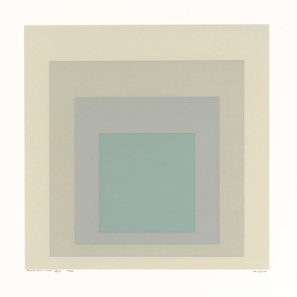
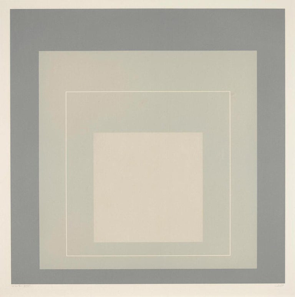
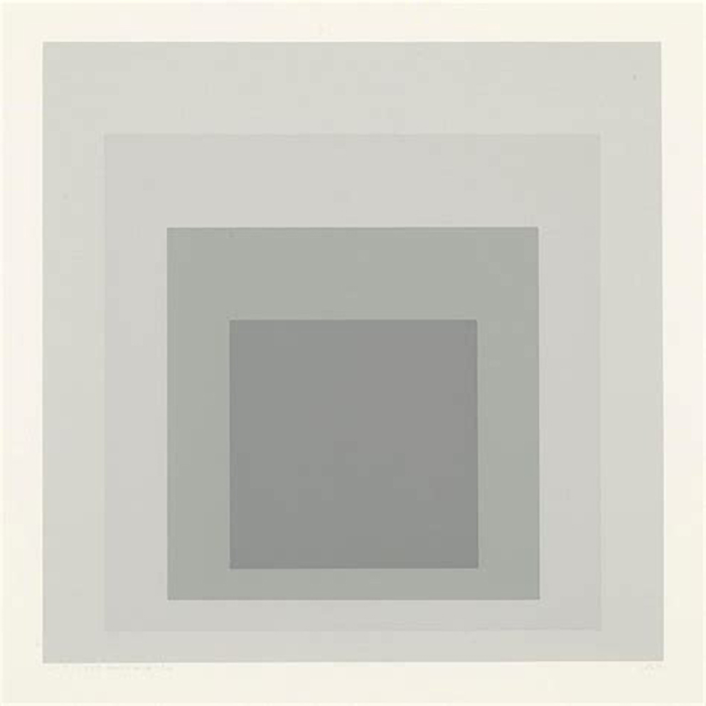
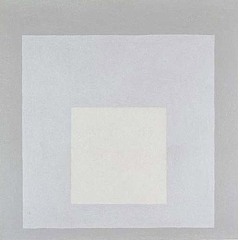
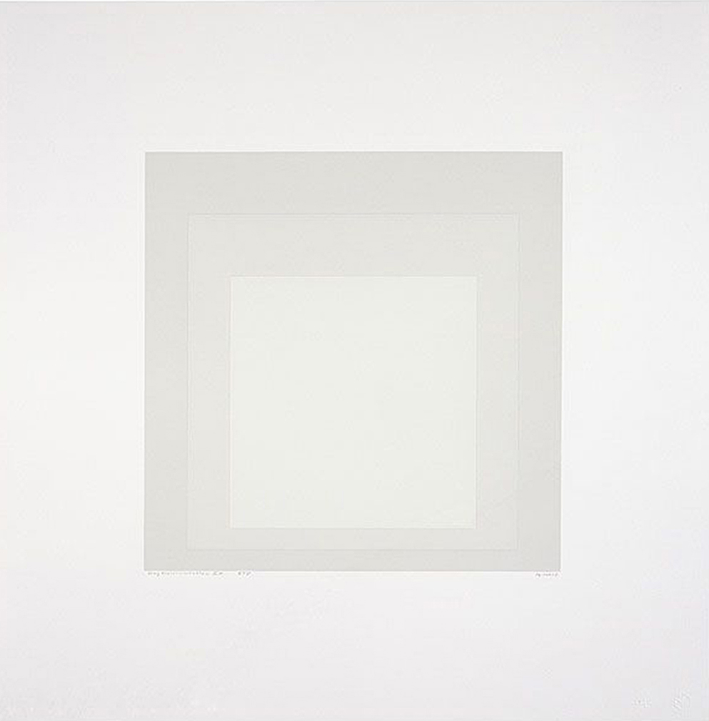
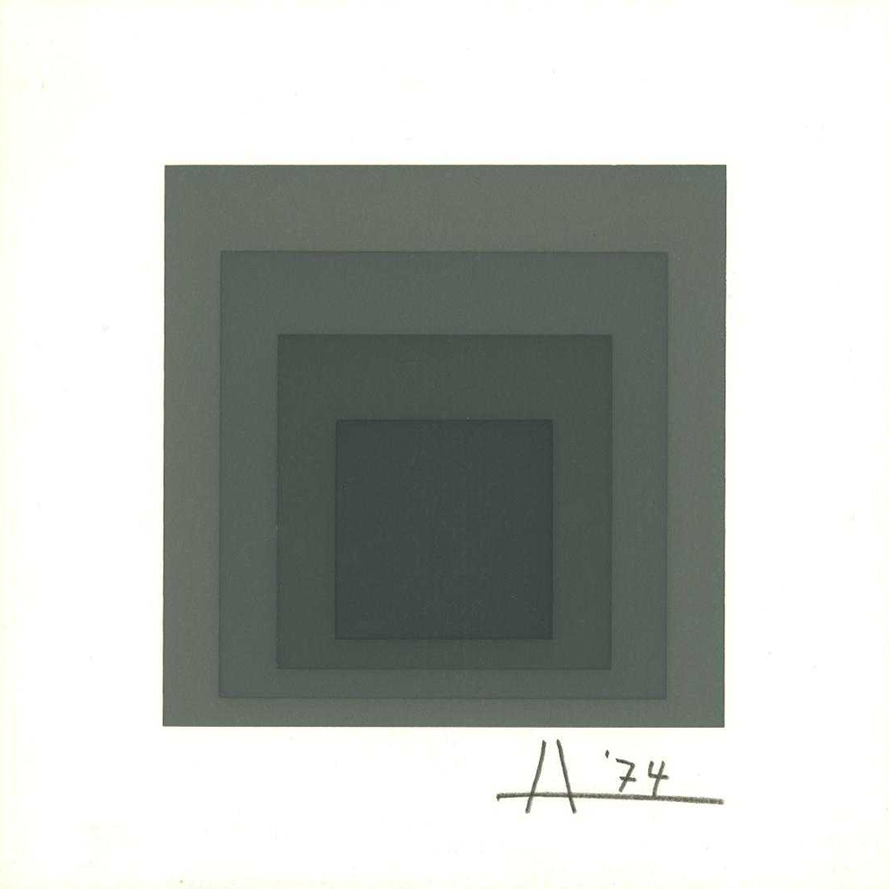
12.3 / Albers’ technique
Homages to the Square
. . . these are not homages to the square so much as “platters to serve colour”. They are hymns to the infinite possibilities, both physical & spiritual, of hue & light.
Another duality exists in the way that what appears to be very straightforward, mechanical & simple, is ultimately mysterious & ambiguous. . . His father, a house painter, had told him that when painting a door you should start at the centre & work outwards so as to catch the drips & avoid getting your cuffs dirty. And he always started his ‘Homages’ at the centre, carefully pushing one colour up against the next without ever overlapping them. He performed this task under well-regulated lighting conditions, and always adhered to one of four formats of nested squares weighted towards the bottom.
There was a reason for all these rules he followed with such ferocious singularity time and again. The flat colours gained extraordinary movement and three-dimentionality. They offered multiple readings. “In action”, Albers wrote, “We see the colours as being in front of or behind one another, over or under one another, as covering one or more colours entirely or in part. They give the illusion of being transparent or translucent And tend to move up or down”.
And then the colours interact. Perfectly flat areas appear shaded; the squares grow darker near one boundary and lighter near another. Nothing is as it seams.
Nicholas Fox Weber
Executive Director
The Josef and Anni Albers Foundation


12.3 / Turner’s palette
Colour & Pigment
Documents at Tate show that Turner closely followed pigment development and used new pigments as they appeared. This interest led him to use new pigments in favour of earlier ones with inferior or unsuitable properties. For example he replaced smalt, which was said to be ‘deficient in impure air’, with cobalt blues that arrived after 1807.
The yellows that were discovered and used in Turner’s time followed the isolation of the metal chromium. A French chemist, Nicolas-Louis Vauquelin, worked on the process to isolate and prepare lead chromate pigments for over ten years, producing a range of yellow shades from chrome lemon to chrome deep yellow. These were first made in England in 1816 and widely used by Turner in both oil and water.
Turner also used Scheele’s green (toxic copper arsenite), which he had substituted with emerald green by the 1830s. Although chemically similar to Scheele’s green, this was an improvement as it was more intense and durable. When viridian became available he combined it with emerald in paintings from the 1840s.
Turner’s watercolours
Pigments found within Turner’s watercolours include: gamboge, quercitron yellow, vermilion, various iron oxides including ochres, umbers and siennas, Indian yellow, green lake, Prussian blue, indigo, cobalt blue, blue verditer and rose madder.
Turner’s Oil
In oil Turner used genuine ultramarine (lapis lazuli), white lead, and a very toxic yellow, orpiment — also known as king’s yellow or, chemically, arsenic sulphide. By the early 19th century, he had replaced it with chrome yellow. There is evidence in the 1800 that he used the lead pigment Naples yellow.
He also used unspecified lake pigments, made by fixing a dye on a base compound such as alumina which turned it into a pigment. This gave the pigments great transparency in oil but less so in water. The choice of dye and base influenced the lightfastness. Turner used at least one red lake, a green and a geranium shade and all were prone to fading. Some early versions of rose madder had poor lightfastness, but the process developed by the outstanding English colour-maker, George Field, was and still is superior.

12.3 / Scheele’s Green
This abstract’s are taken from this wonderful essay ‘Scheele’s Green, the Color of Fake Foliage and Death’ by By Katy Kelleher.
Despite its character flaws, Scheele’s green was striking and profitable. The color was not only cheap to produce, it accurately mimicked the hues found in nature. It wasn’t too yellow, nor was it too teal. It was a middle green with full saturation — no grey tints, no underlying hint of brown. It was a vegetal green, the colour of fiddleheads and ivy vines. It was a garden colour, and for city dwellers, the allure of Scheele’s green was impossible to resist (even though the Victorians were well aware of the toxic effects of ingesting arsenic).
This was a time when Londoners and Parisians alike were concerned with the dandification of modern society. The Industrial Revolution had turned their streets ugly and grey with smog. It had also (supposedly) turned their men into simpering weenies who didn’t do God’s honest work, like toiling in the fields, but instead hung out around bars and smoked and worked white-collar positions. Some Victorians (those with the most selective memories or a rather tenuous grasp of recent history) longed to return to that fabled pastoral Eden where men were men and women wore wreaths of fragrant flowers. And since fresh flowers didn’t last long enough for multiple wears, cloth reproductions would have to do. (Unsurprisingly, this was also a time when the English — and their counterparts in Europe — became very interested in protecting green spaces within the urban landscapes. Many of London’s finest public gardens date back to this era.)


