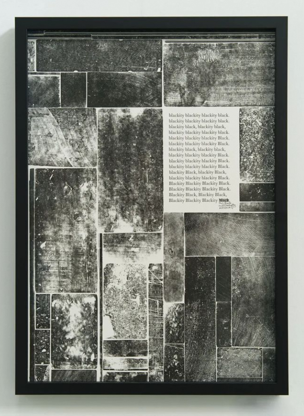
04.2 / Prints

04.2 / Living Ink — Breathe in
Normal Phenomena of Life
Lessons From The Living World edition
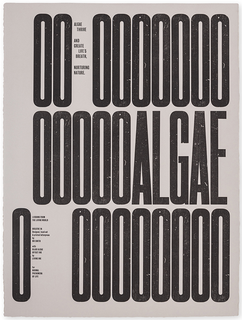
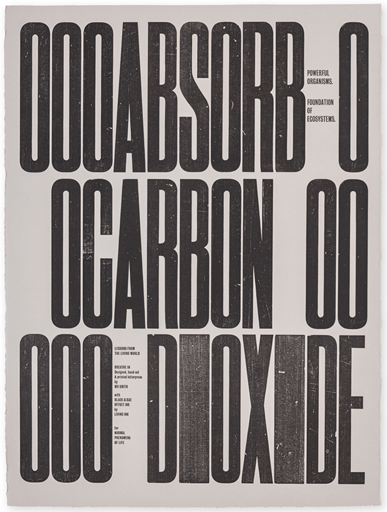
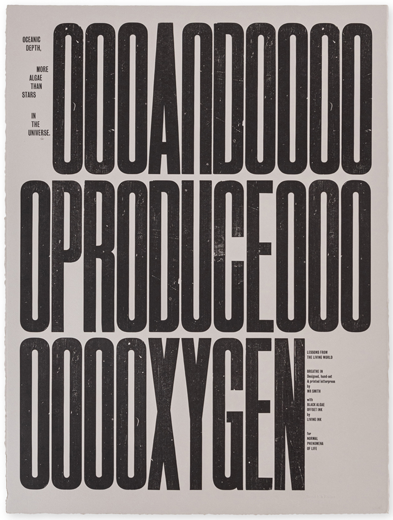
Breathe In
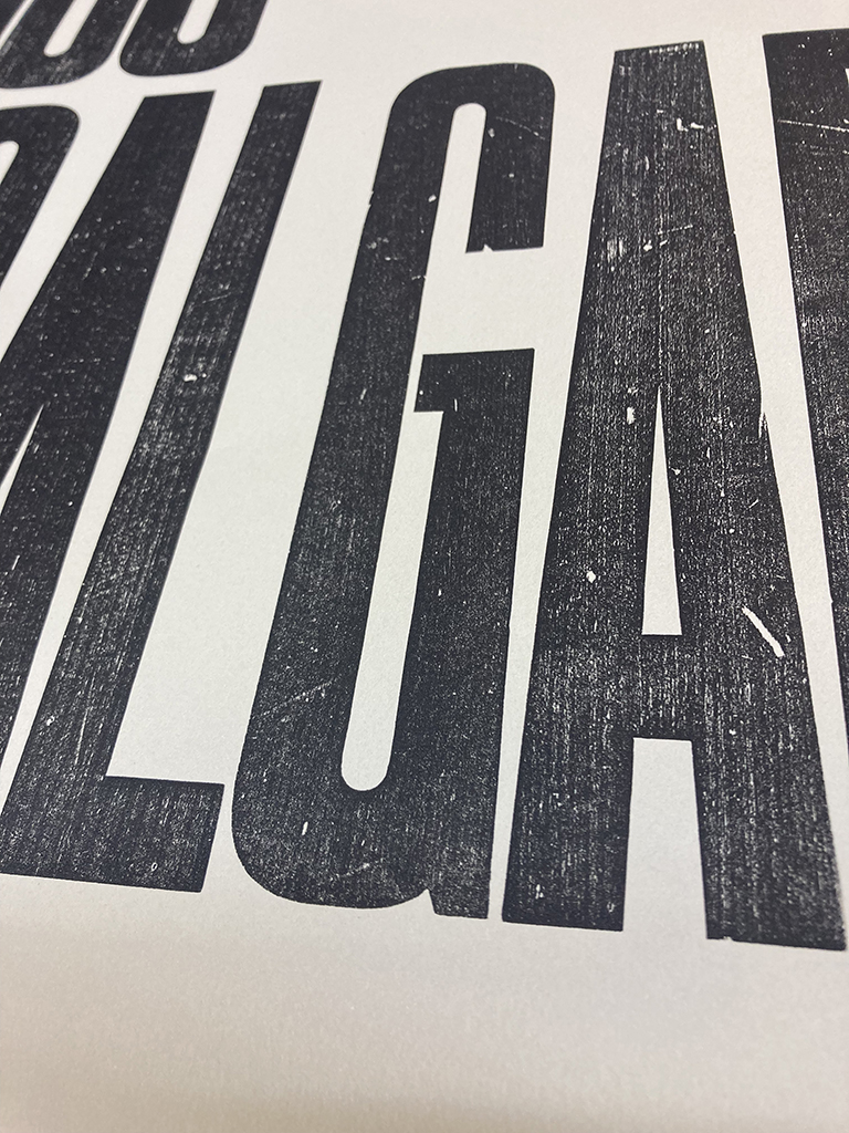
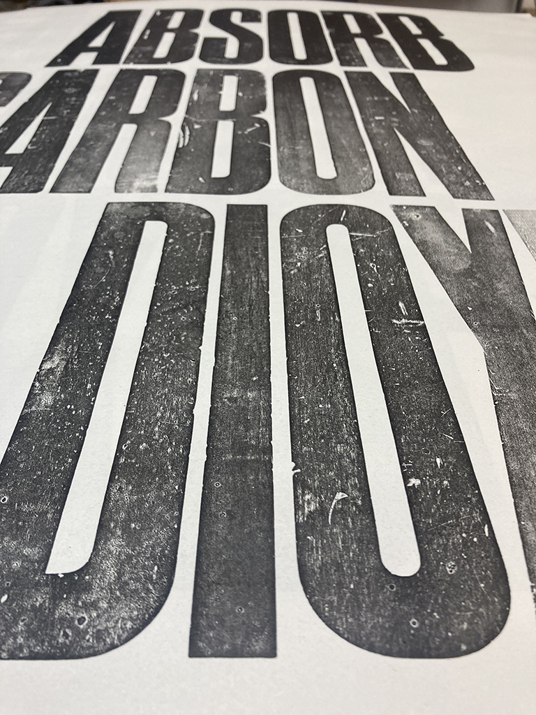
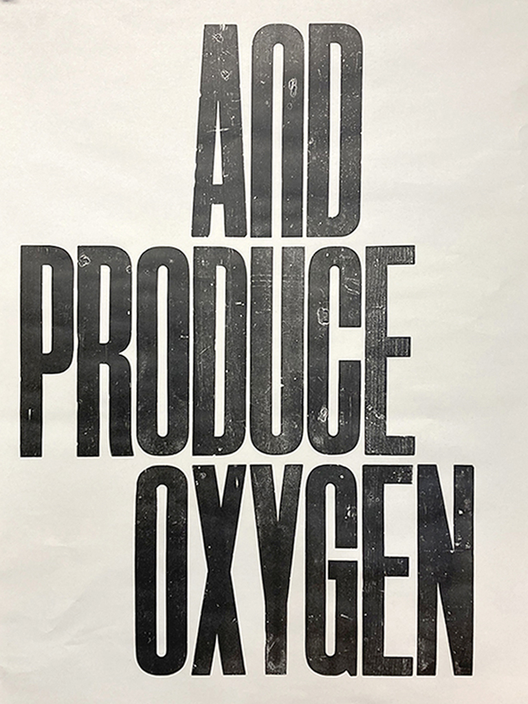
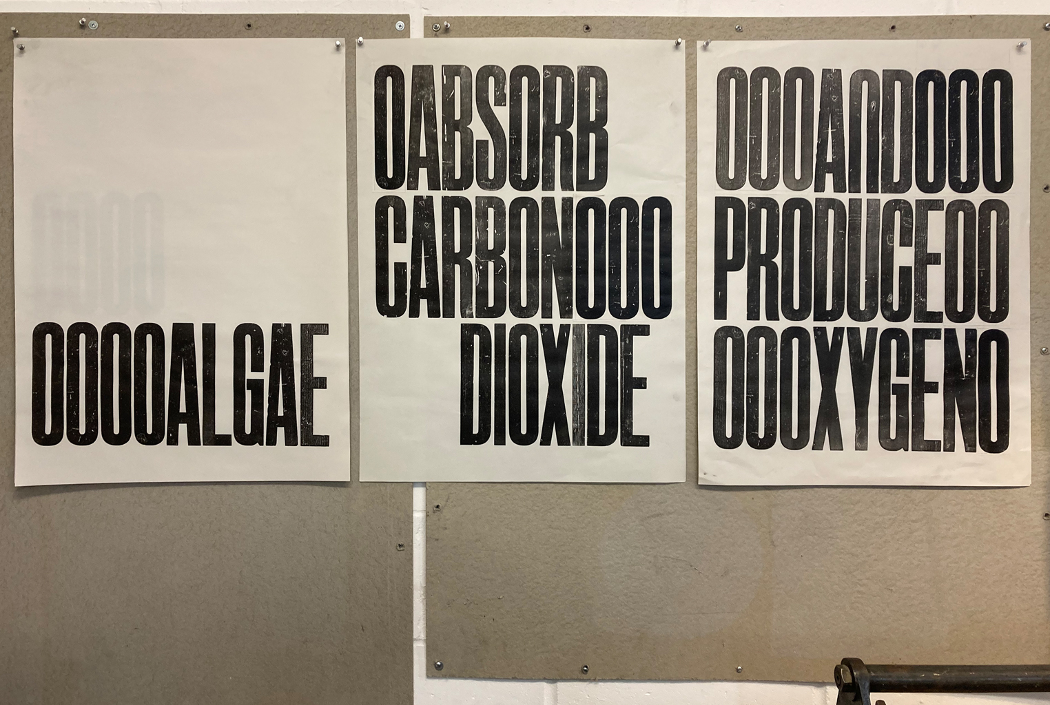
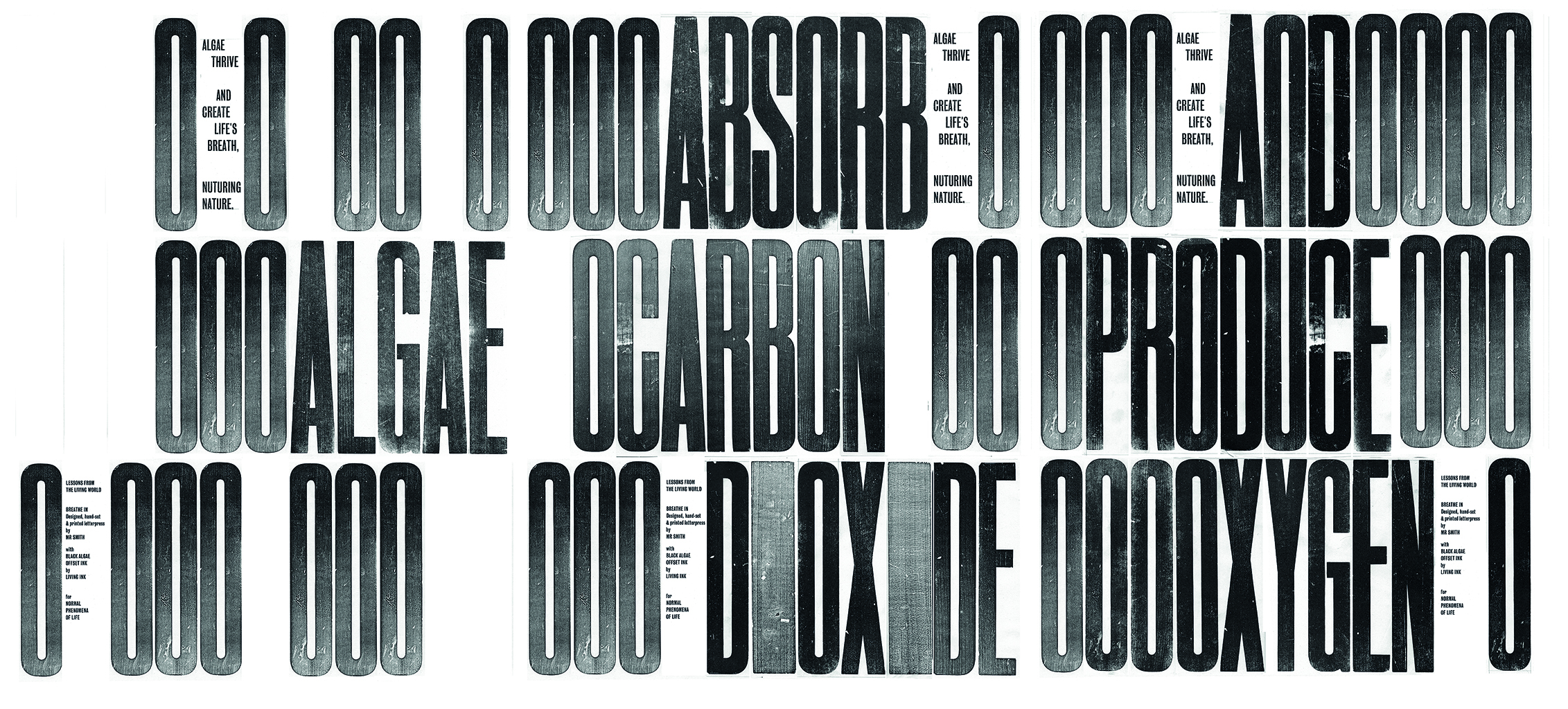
A set of 3 sequential prints
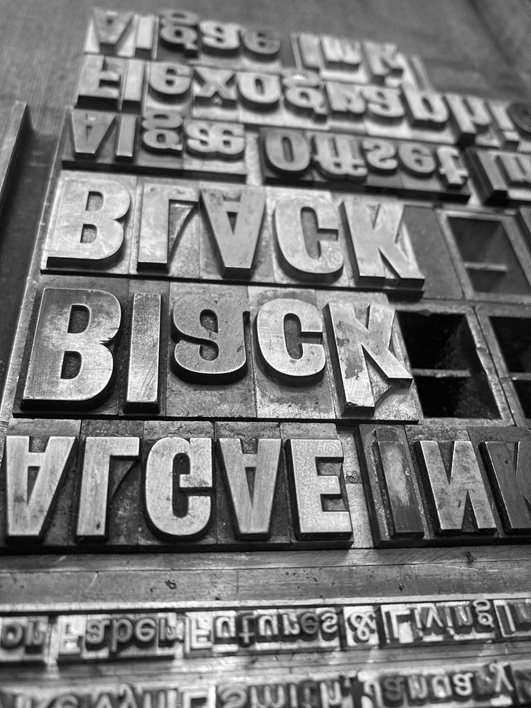
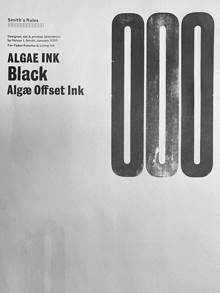
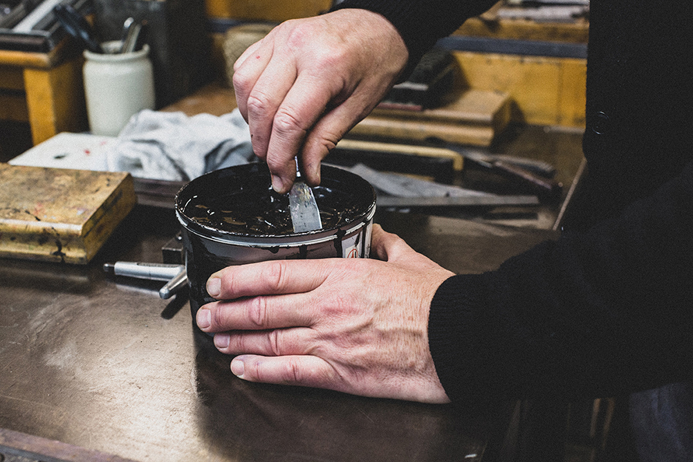
“Each time we inhale, roughly 50% of the oxygen drawn into our lungs was produced by algae. Bruton-based artist Kelvyn Smith pays homage to the producers of this vital life source through a triptych of letterpress prints representing, on paper, the role algae plays in converting carbon dioxide into oxygen. Printed with toxin-free, carbon-negative ink made from algae.”
“This limited edition artwork series has been printed on high-quality 100% cotton archival stock with toxin-free, carbon-negative ink made of algae. The unique letterpress exploration celebrates the craft of printmaking and honours the fundamental role played by algae in the ecosystem.”
FOR SALE HERE
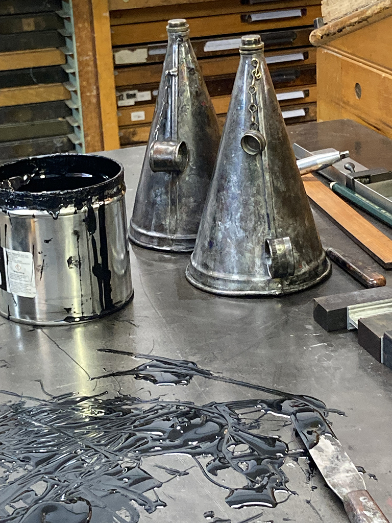
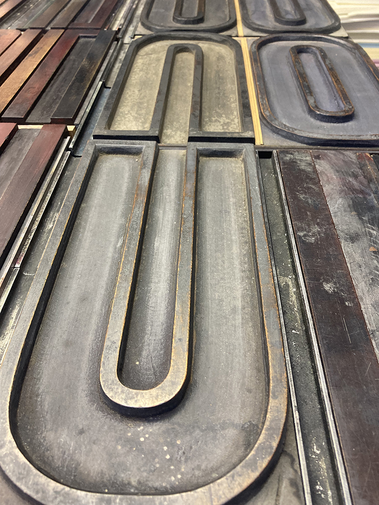
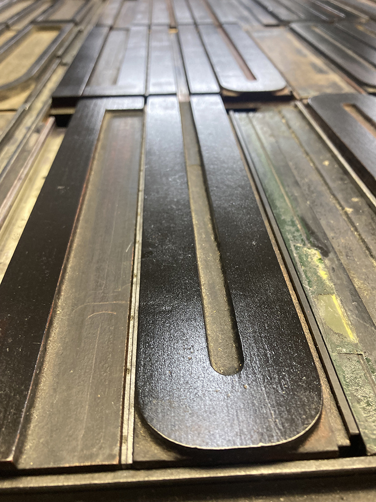
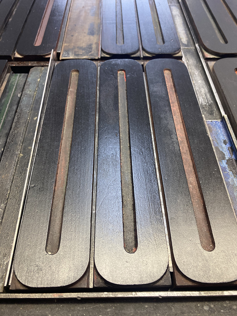
Designed, hand-set & printed letterpress
with Black Algae offset ink by Living Ink
on 280gsm BFK Rives Grey printmaking paper
at 560x760mm

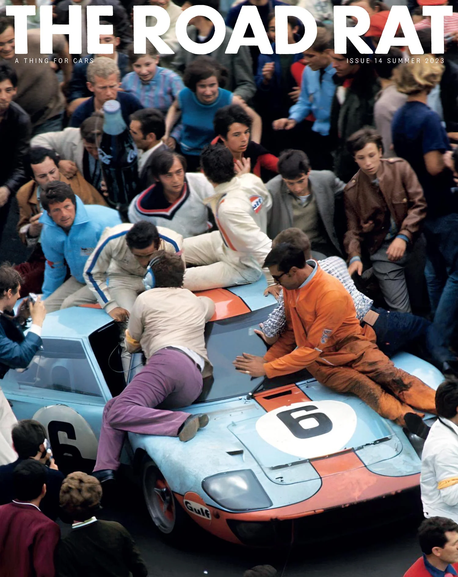
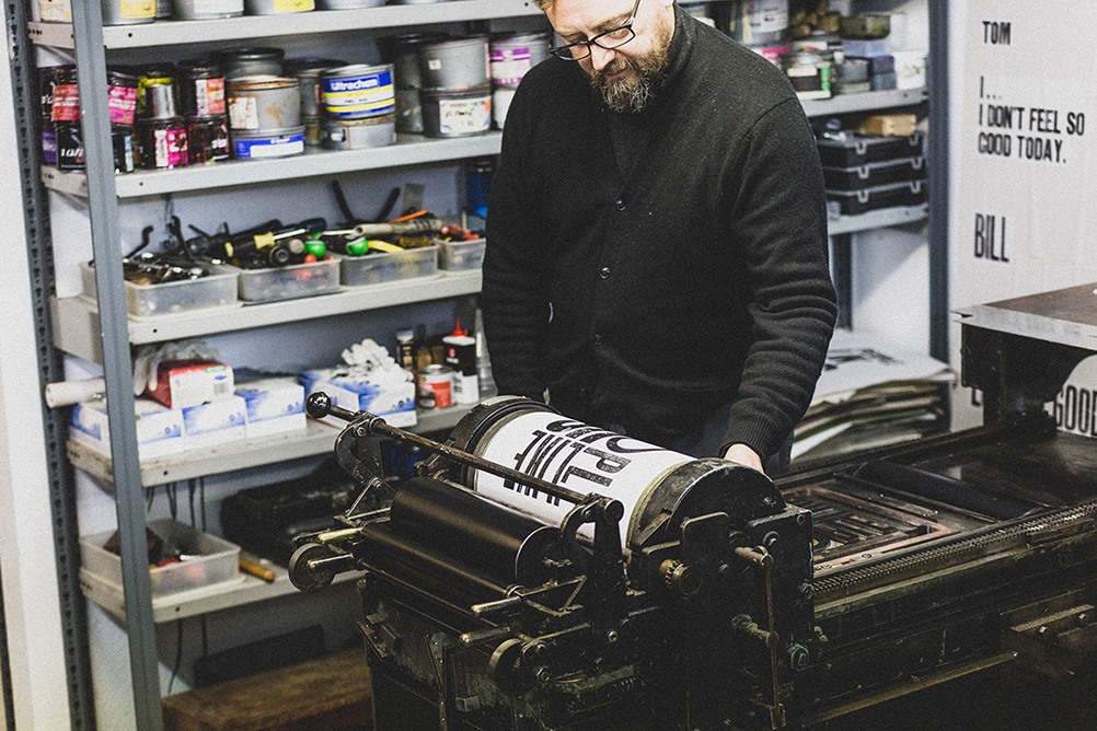
THE ROAD RAT / Magazine / Issue 014
“The 14th edition of The Road Rat is dedicated entirely to celebrating the greatest race of them all — Le Mans.”
General outline . . .
+
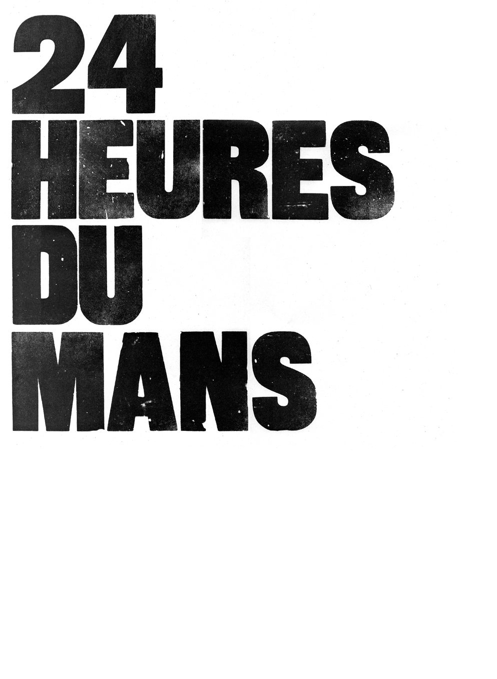
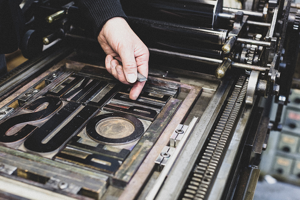
I have used a ’20 line Grotesque bold’ wood letter type for the front cover / (20 line = 20 picas) / Typically an English form & a strong poster type based on 19th Century styles
but probably made in the mid 20th Century
The bold type for the back pages is a metal (lead) type at 60 point / it is Grotesque 9 made by Stephenson Blake of Sheffield /
set in Upper & lower case
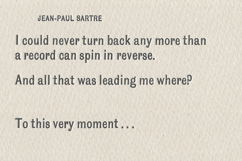
JEAN-PAUL SARTRE
set in 18pt / range left U&lc /
Condensed Sans 5 /
with a smaller 10pt name credit in spaced capitals
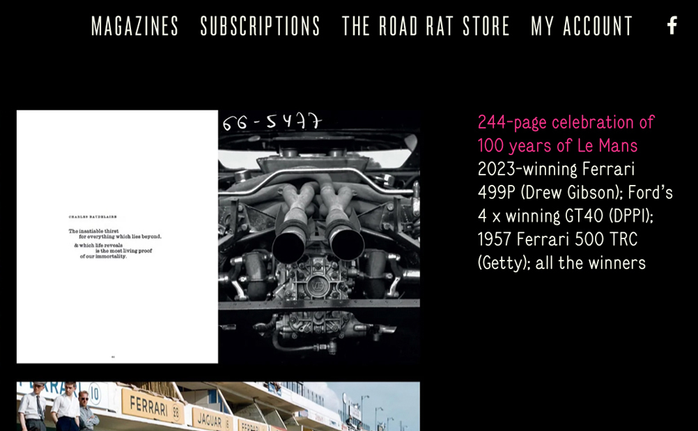
CHARLES BAUDRLAIRE
set in 18pt / range left U&lc /
Consort light U&lc / ‘vertically justified’
with a smaller 12pt name credit in spaced capitals
are both founders types by Stephenshon Blake of Sheffield
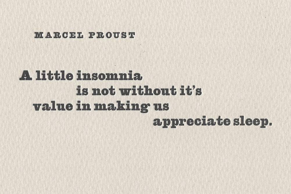
MARCEL PROUST
set in 18pt /
with an Egyptian slab serif called Antique /
with a smaller 10pt name credit in spaced capitals
all compositions were designed, hand set & proofed on a vandercook cylinder press
at my somerset workshop
initially on newsprint & finally on a 280gsm Somerset Grey printmaking paper
everything was proofed in a very dark greeny-grey (PMS 418)
which i have pre-mixed in a tin & use as my ‘house colour’
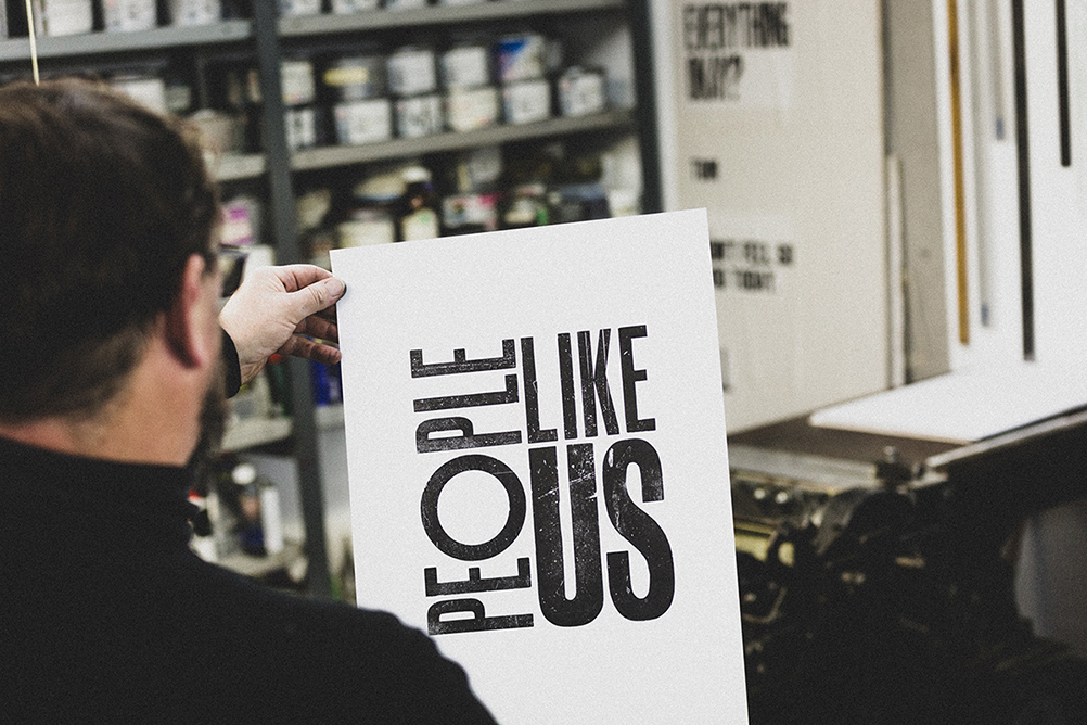
Design consultancy ‘People Like Us’ . . .
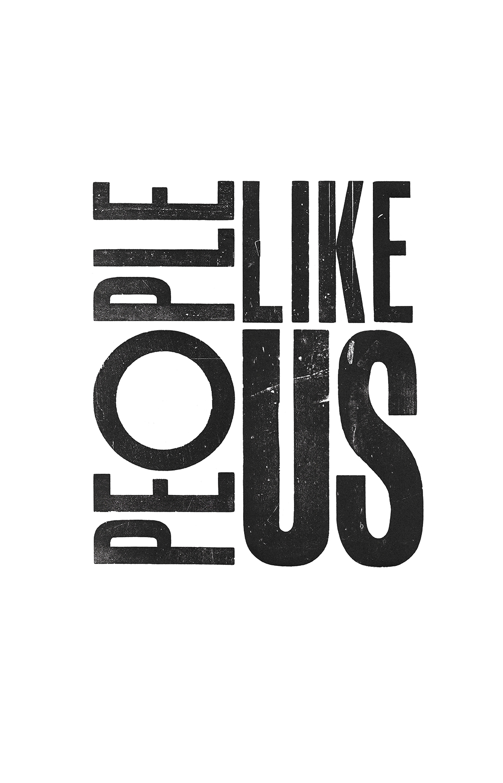

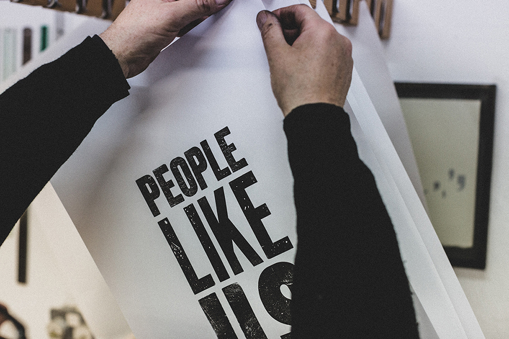
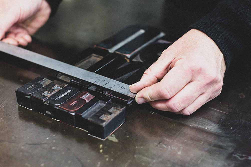
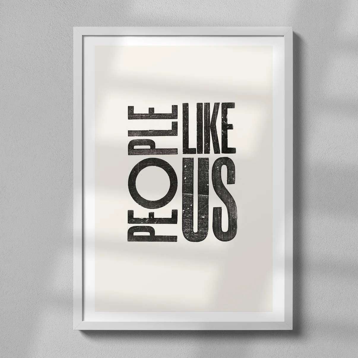
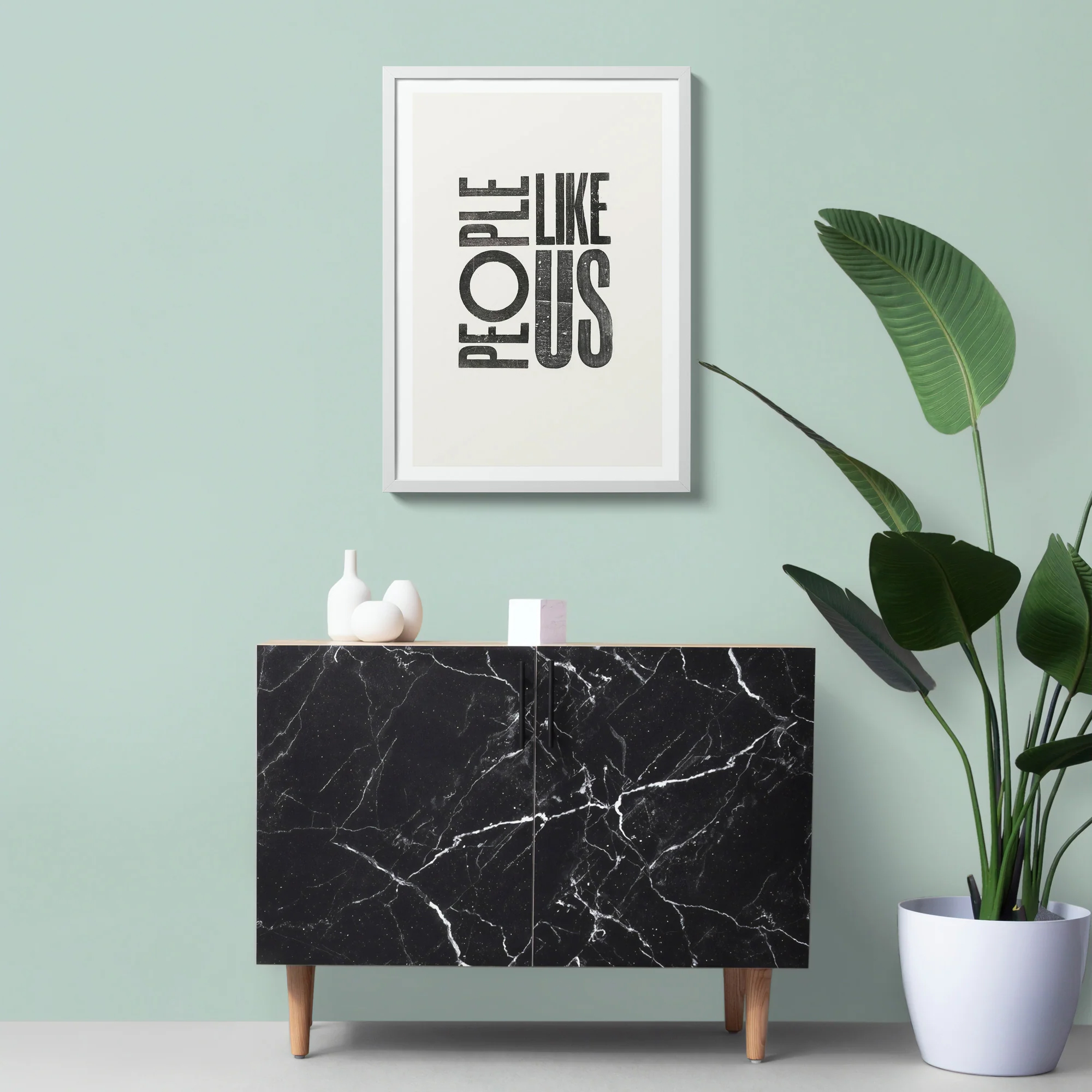
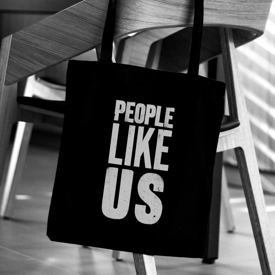
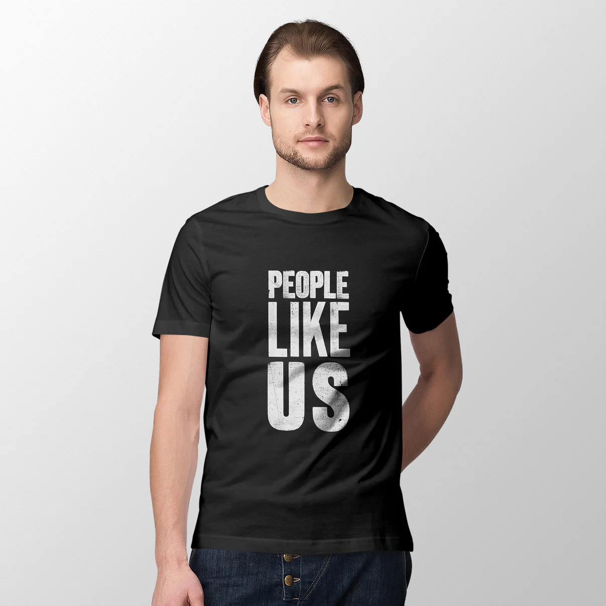
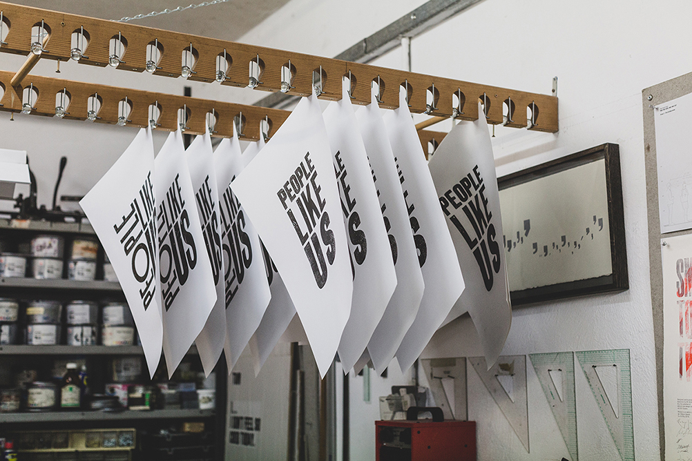
Design consultancy ‘People Like Us’ . . .