“I will not subscribe to the argument that ornament increases the pleasure of the life of a cultivated person, or the argument which covers itself with the words: “But if the ornament is beautiful! . . . ”
To me, and to all the cultivated people, ornament does not increase the pleasures of life. If I want to eat a piece of gingerbread I will choose one that is completely plain and not a piece which represents a baby in arms of a horse-rider, a piece which is covered over and over with decoration.
“The development of culture is concurrent with the removal of ornaments from objects of daily use”
“I have emerged victorious from my thirty years of struggle. I have freed mankind from superfluous ornament.”
Ornament and Crime: Selected Essays

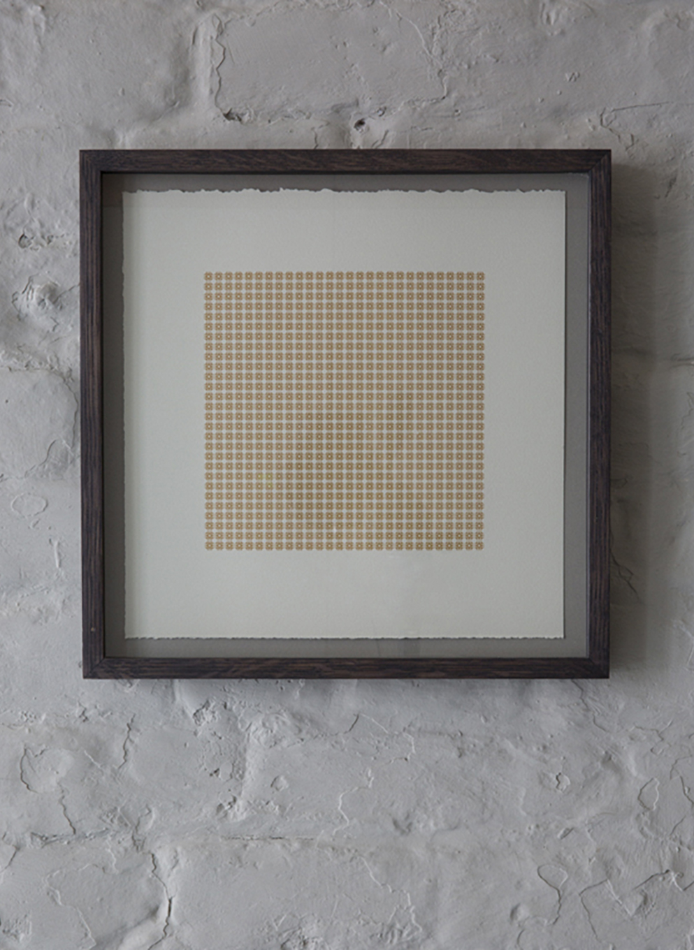
Commissioned by Karoline Newman as a response to ‘Simon Lewty & The Nereids’ at The Lettering arts Trust, Snape Maltings, Suffolk. Depictions of the ‘Mythical Nereids’ created by 26 Artists represented by the Lettering Arts Trust.
![]()
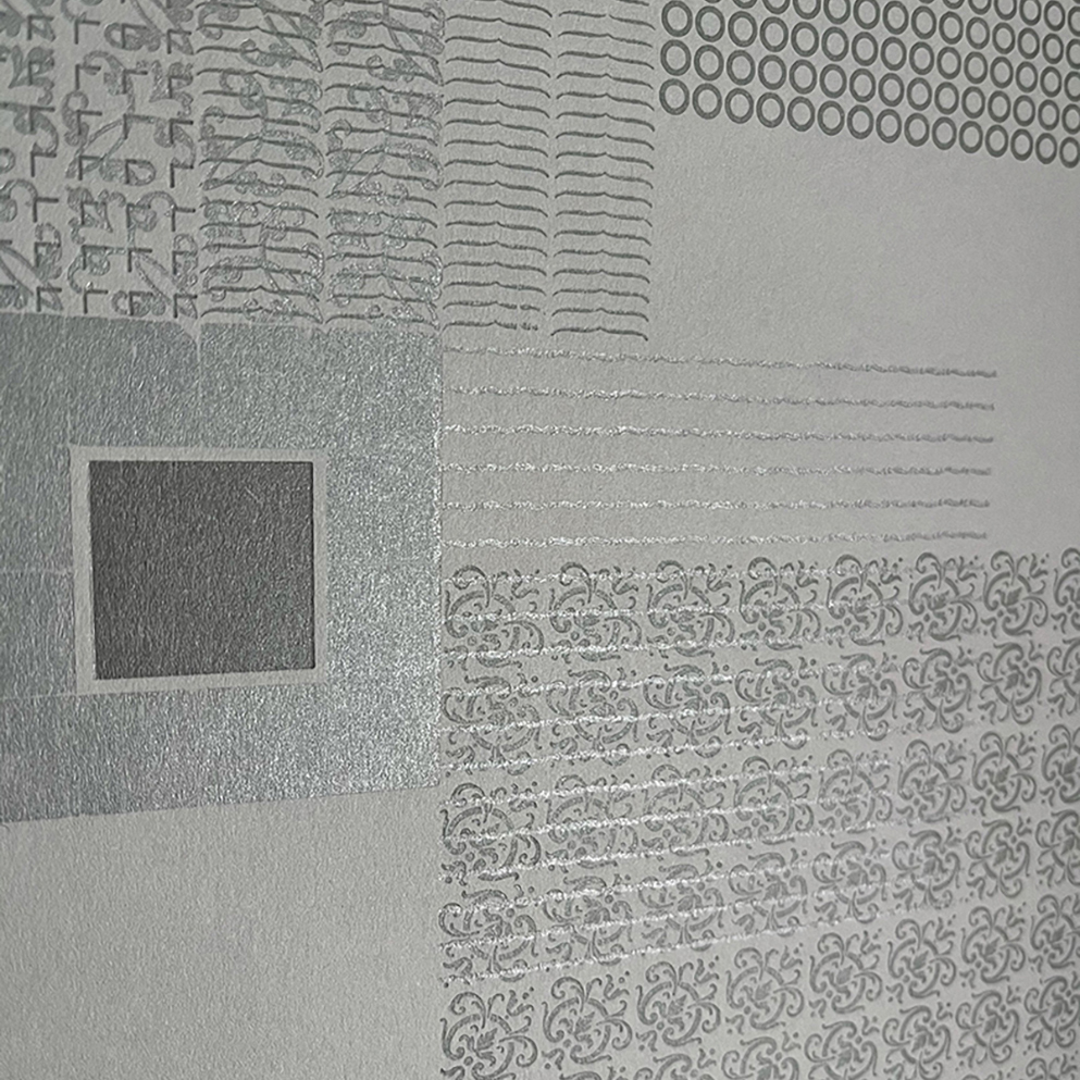
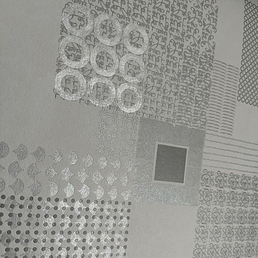
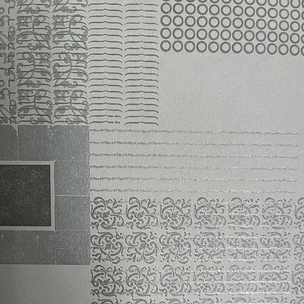
GLAUKONOME
The Nereid of the ‘mastering the grey’ sea
(framed)
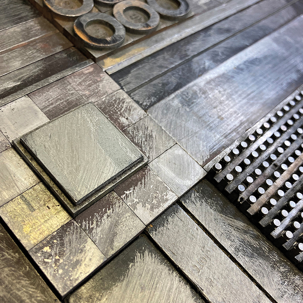
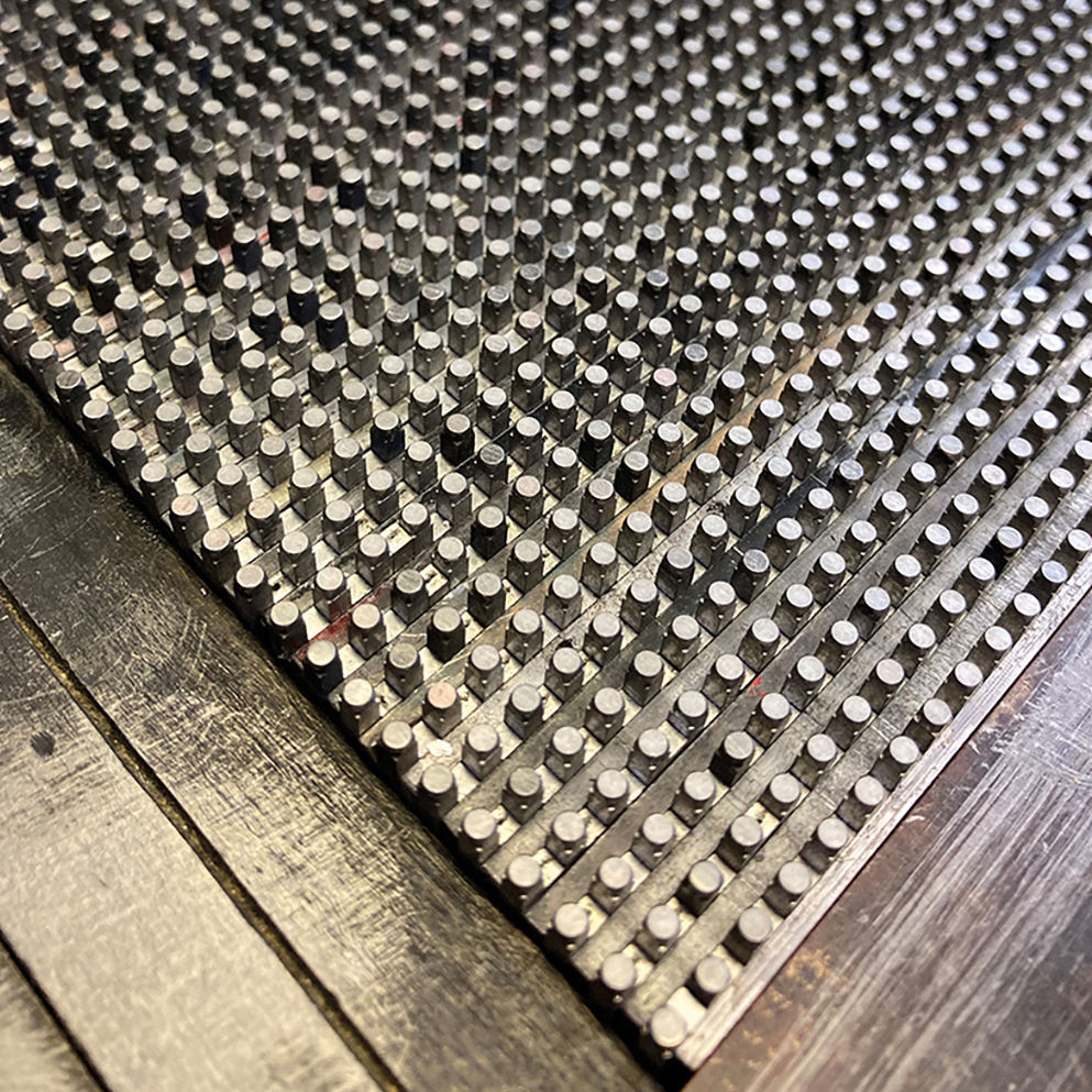
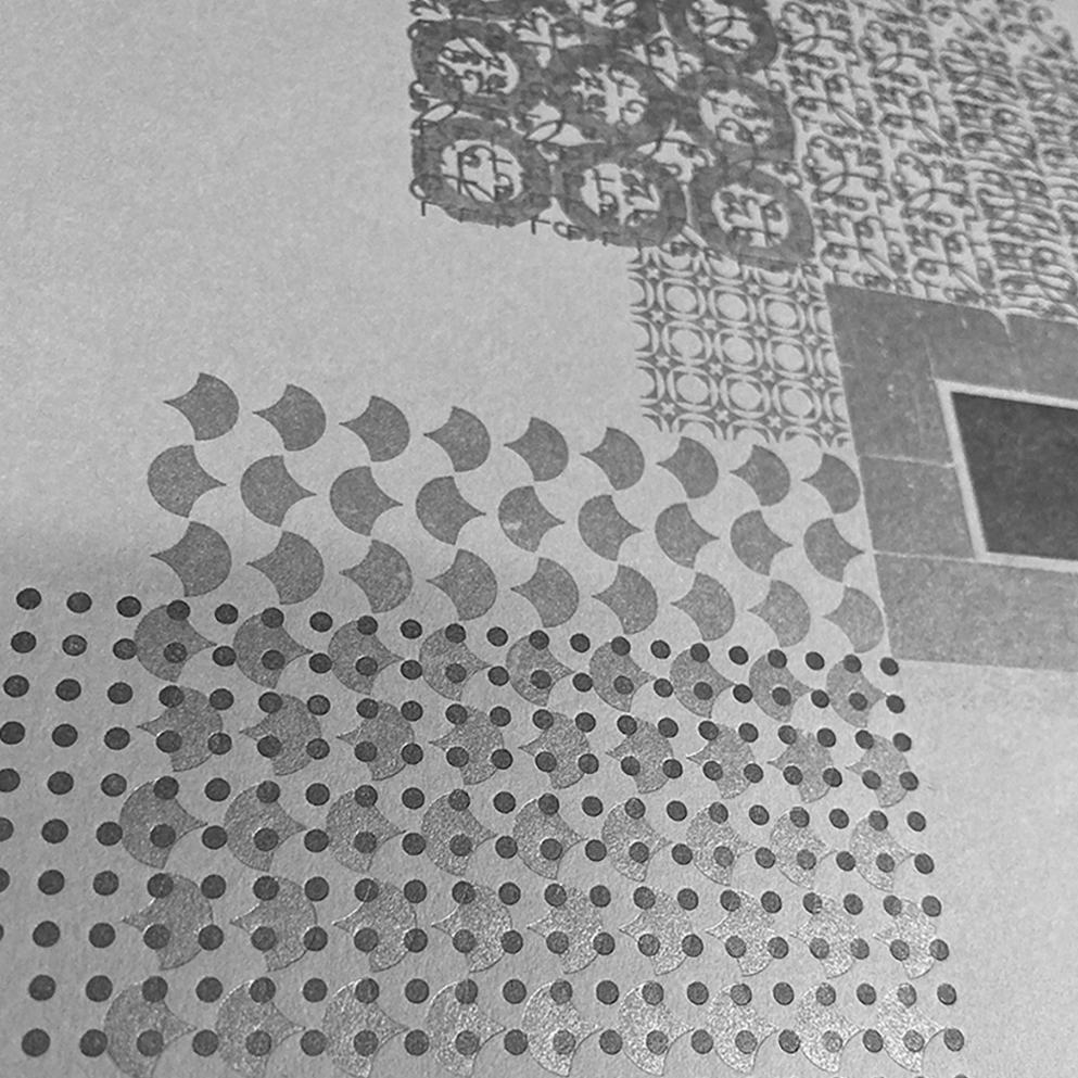
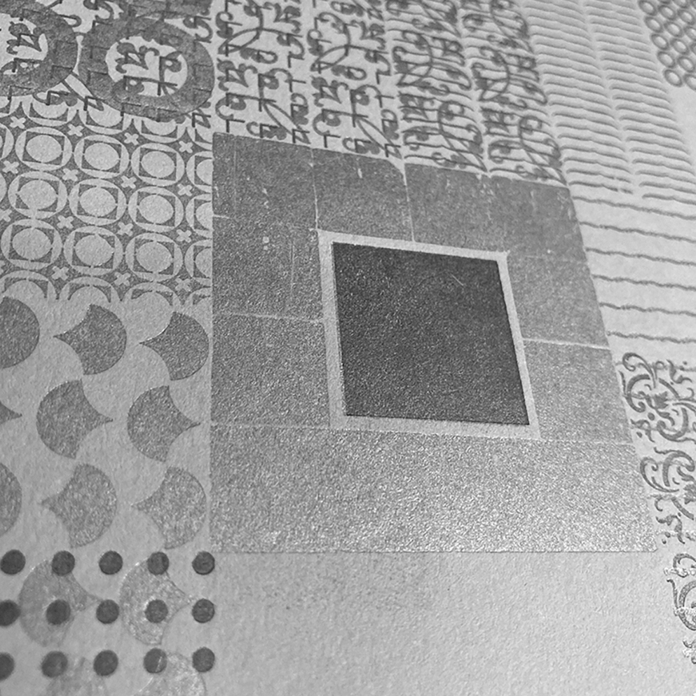
Designed / hand-set / composed
by Kelvyn Laurence Smith
with a careful selection of monotype ornaments / decorative borders & typographic sorts
Printed letterpress on a Vandercook Universal 4 /
in various Greys / Greens & Silvers /
on a GF Smith 270gsm Colour plan Real Grey
in a very limited edition of 6
12 x 12 inches (300 x 300 mm)
Signed on the reverse by the artist
Buy from Section 3 of the Print Shop
The Nereids were sea nymphs in Greek mythology, fifty in total, daughters of Nereus and Doris. They helped sailors on their voyages when they faced fierce storms. They lived with their father in the depths of the Aegean Sea. One of the better known Nereids was Thetis, who was the mother of the hero Achilles.
In Greek mythology, the Nereids are sea nymphs (female spirits of sea waters), the 50 daughters of the ‘Old Man of the Sea’ Nereus and the Oceanid Doris, sisters to their brother Nerites. They often accompany Poseidon, the god of the sea, and can be friendly and helpful to sailors (such as the Argonauts in their search for the Golden Fleece).
The Nereids symbolized everything that is beautiful and kind about the sea. Their melodious voices sang as they danced around their father. They are represented as beautiful women, crowned with branches of red coral and dressed in white silk robes trimmed with gold. These nymphs are particularly associated with the Aegean Sea, where they dwelt with their father Nereus in the depths within a golden palace.

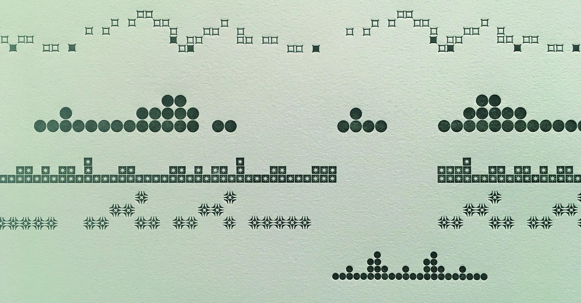
03.4 / A study in Ornamental Composition

Made for:
An Orchestra of Letters — a major exhibition by the Lettering Arts Trust at Snape Maltings.
2 June – 3 September 2017
An exhibition of new works by 36 lettering artists for the 50th Anniversary of the Concert Hall at Aldeburgh Festival and the Snape Proms at Snape Maltings in 2017.
‘A study in Ornamental Composition’
Is inspired by the final track on Van Morrison’s 1972 album ‘Saint Dominic’s Preview’
Introduction / Inspiration / analysis
For me – Van Morrison’s seminal 10 minute track ‘Almost Independence Day’ seems to connect the awe-inspiring power of the sea with emotional intensity & longing.
Written in the early 70’s – the track represents the physical and abstract descriptions of a vast Pacific Ocean as seen from San Francisco bay.
With the rolling repetitive Moog synth ‘effectively used as a foghorn bass’ – the delicate snare drum triggers electrifying notions of firing synapses, daydreaming, memories – and the whole woven texture is reminiscent of home, family, things past and the excitement of those to come . . . 12-string and 6-string guitars dues and converse with the stuttering, yearning voice – a hypnotic transmission.
Rolling Stone critic Stephen Holden captures perfectly:
“. . . the body of the song is an incantatory montage of simple portentous phrases repeated over and over with varying emotional emphasis . . . the structure of the song is metamorphic, taking the form of a rising and subsiding wave.”
With reference to . . .
Growing up on the Kent coast with the vast flat Greeny-Grey north sea horizons, choppy waves & rolling ‘white horses’, this particular sea has always had an important influence on me. Home, happy, safe; but with the awesome frightening power that the sea brings; exciting ideas of ambition and optimism, the scale of adventure, journeys, future endeavours. Seasonal colour palette – tidal pulses and the angry crashing of stormy swellings.
Idea / concept / intention
The simple conceit of this work was to explore/express a visually elegant way to capture the sensory emotion of the track. The idea ‘nods’ to the musical heritage of the east coast of Britain and encapsulates – in at least a representational and abstract form – the themes of the music, the landscape & the exhibition.
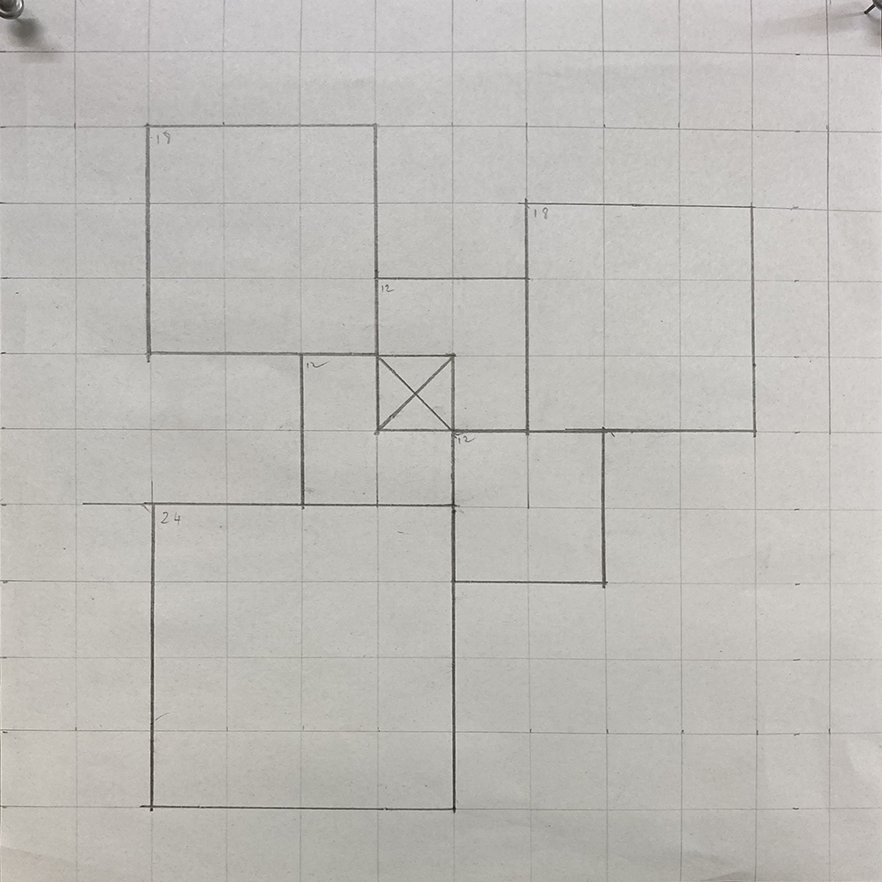
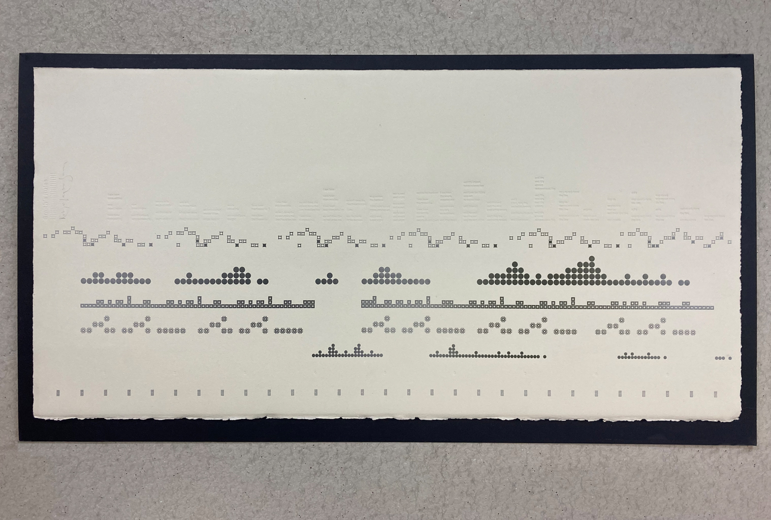
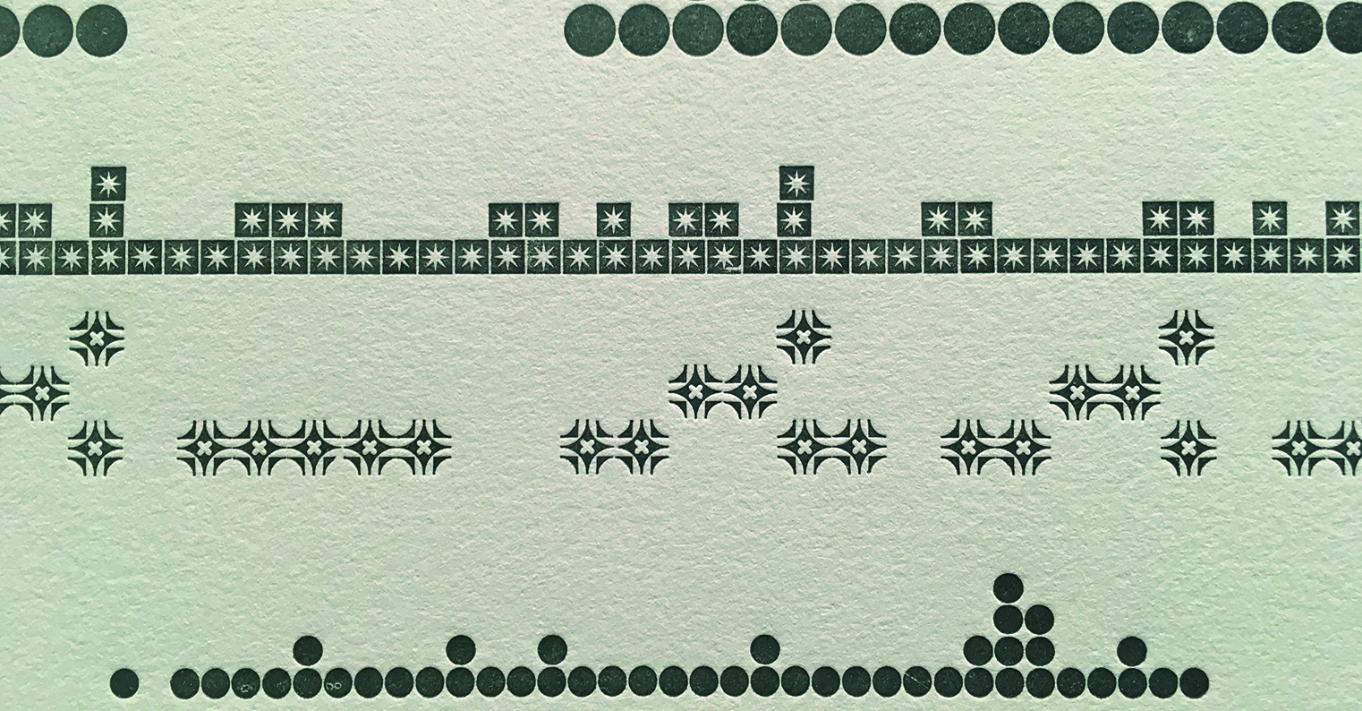
Technical & structural approach
Using a simple typographic structure, the grid acts as a kind of stave and – although not wholly accurate – endeavours to capture the rhythm of the original composition. The horizontal axis forms a time line and plots the progression and interaction of each instrument. Each of these are represented by a different expressive typographic shape or ornament and describe the repetitive nature of the sound. Set individually by hand, these ornaments become a typographic translation and form a swell; a mood, a longing and a simple rhythmic composition that – despite being conceived on the west coast of America – is indicative of my English east coast.
KLS
. . .
Designed & hand-set
with Metal type Ornaments & Metal Type
& Printed in a Limited Edition of 12
in Various Green & Grey inks
with a blind de-bossed lyrics /
on 280gsm BFK Rives Grey /
& a blind de-bossed credit
760 x 380mm (30 x 15 inches)
Signed by the Artist
Buy from Section 5 of the Print Shop
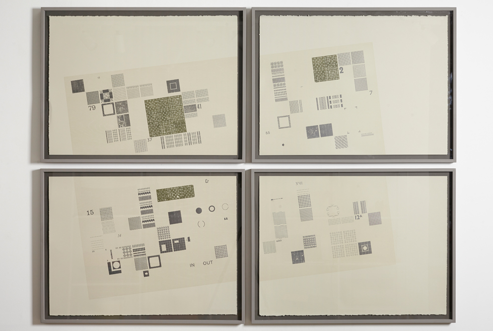
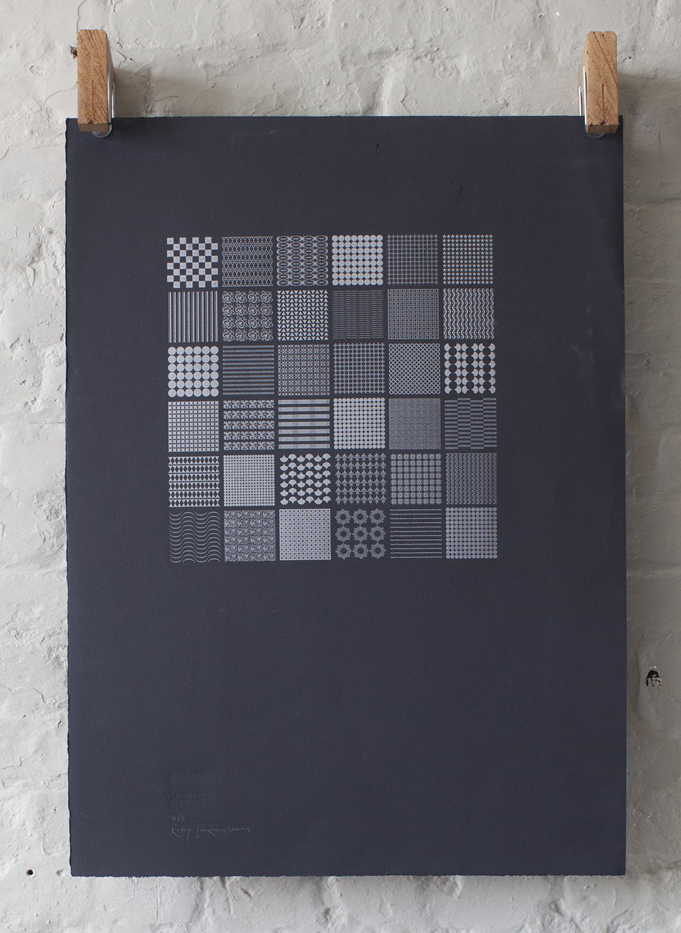
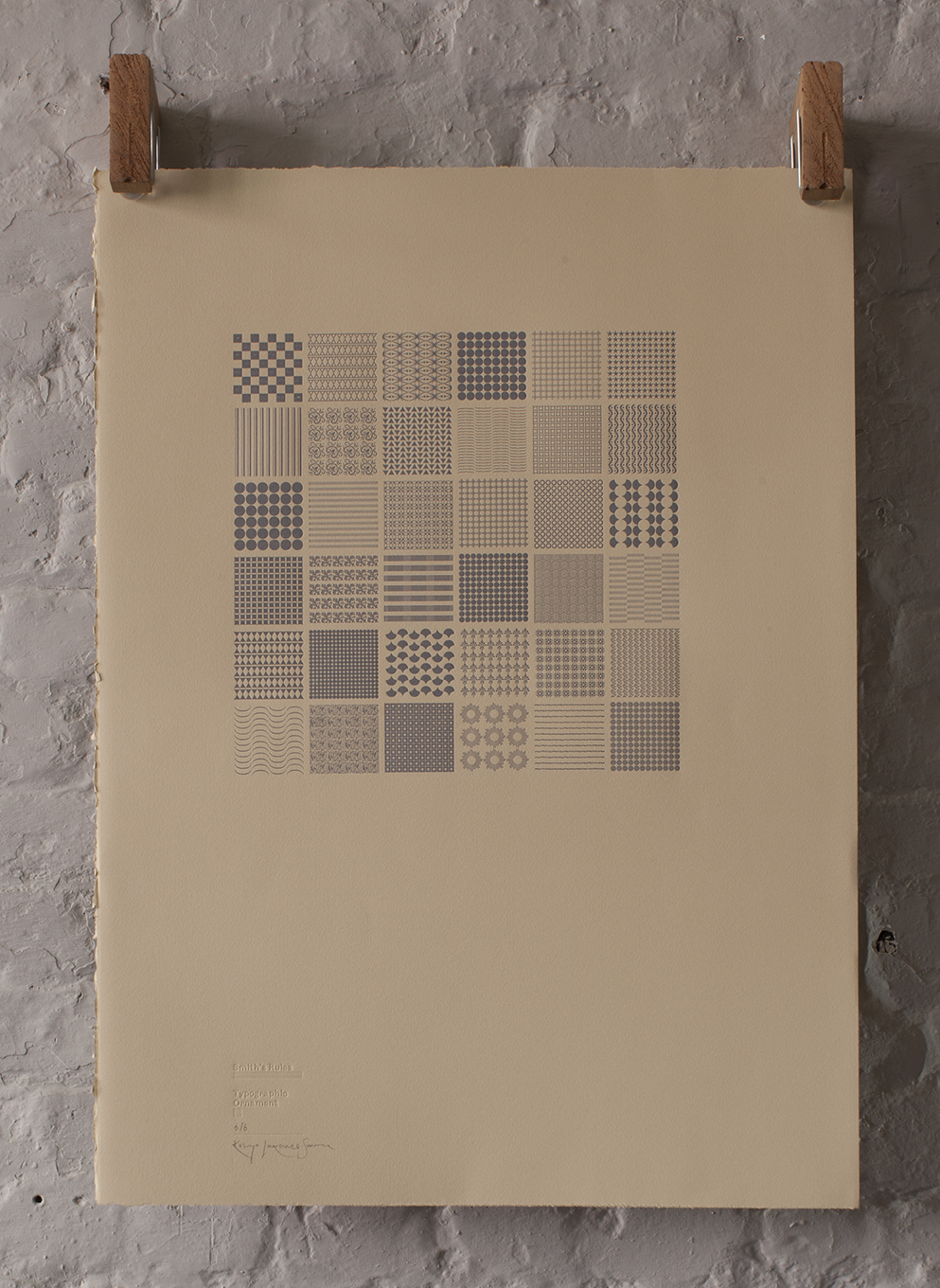
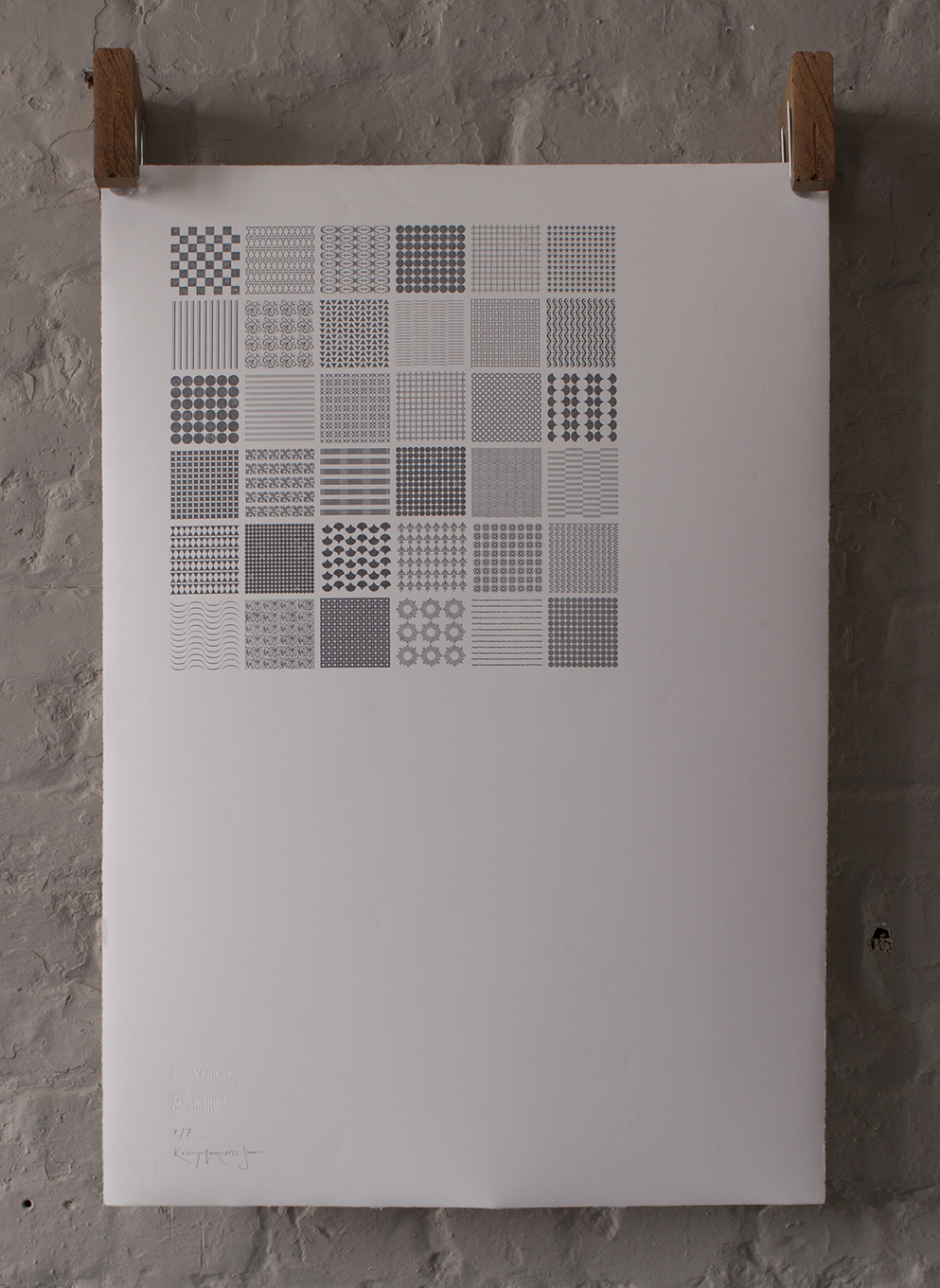
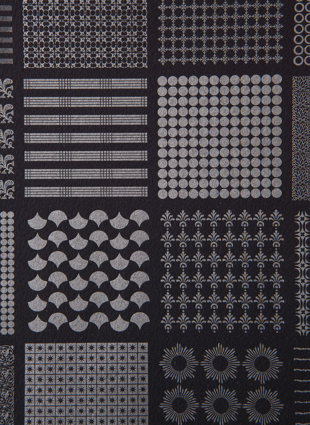
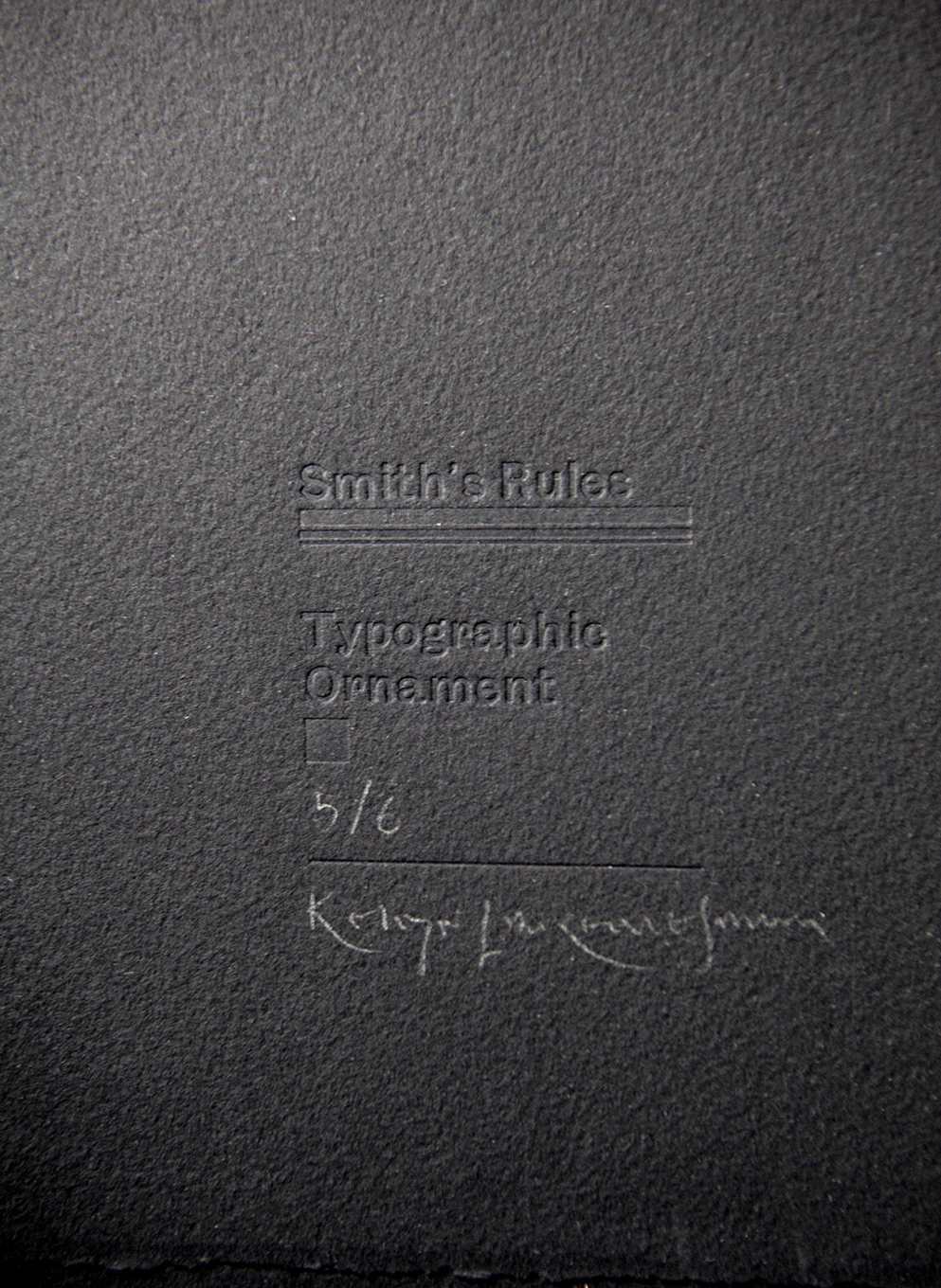
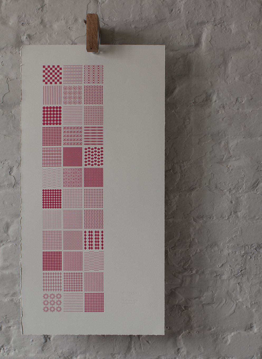
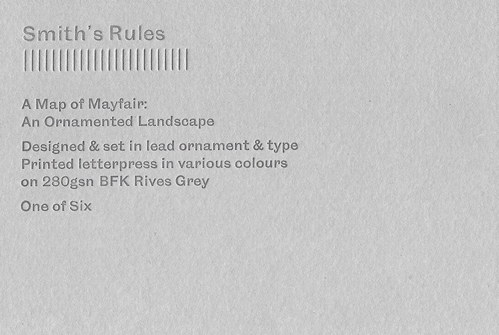
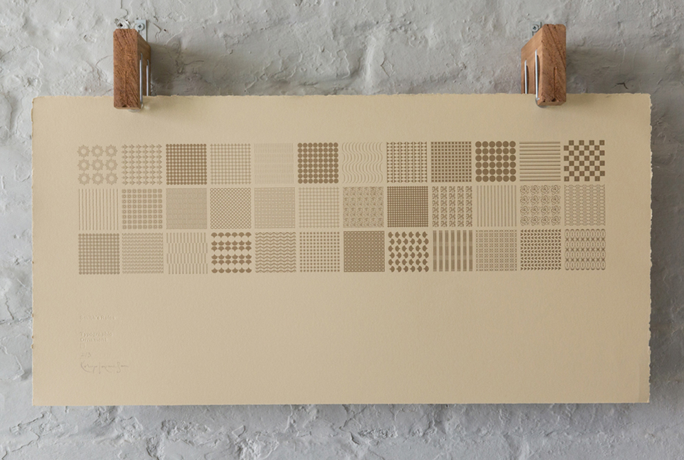
03.4 / An Ornamented Map of Mayfair
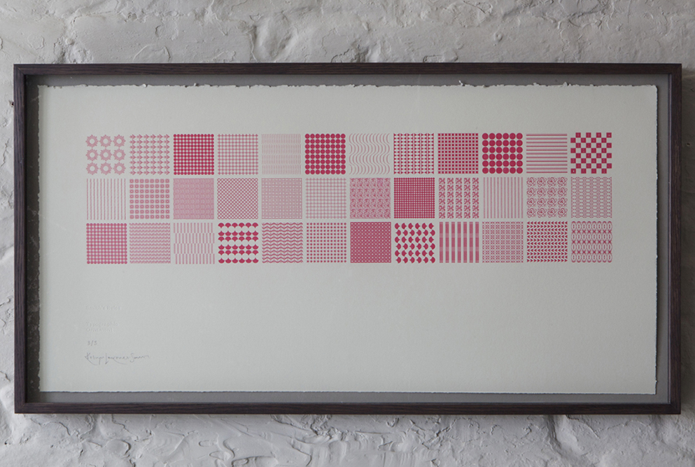
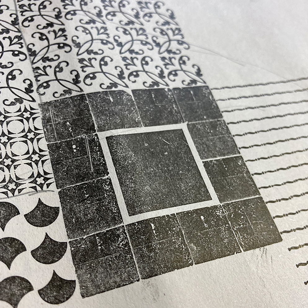
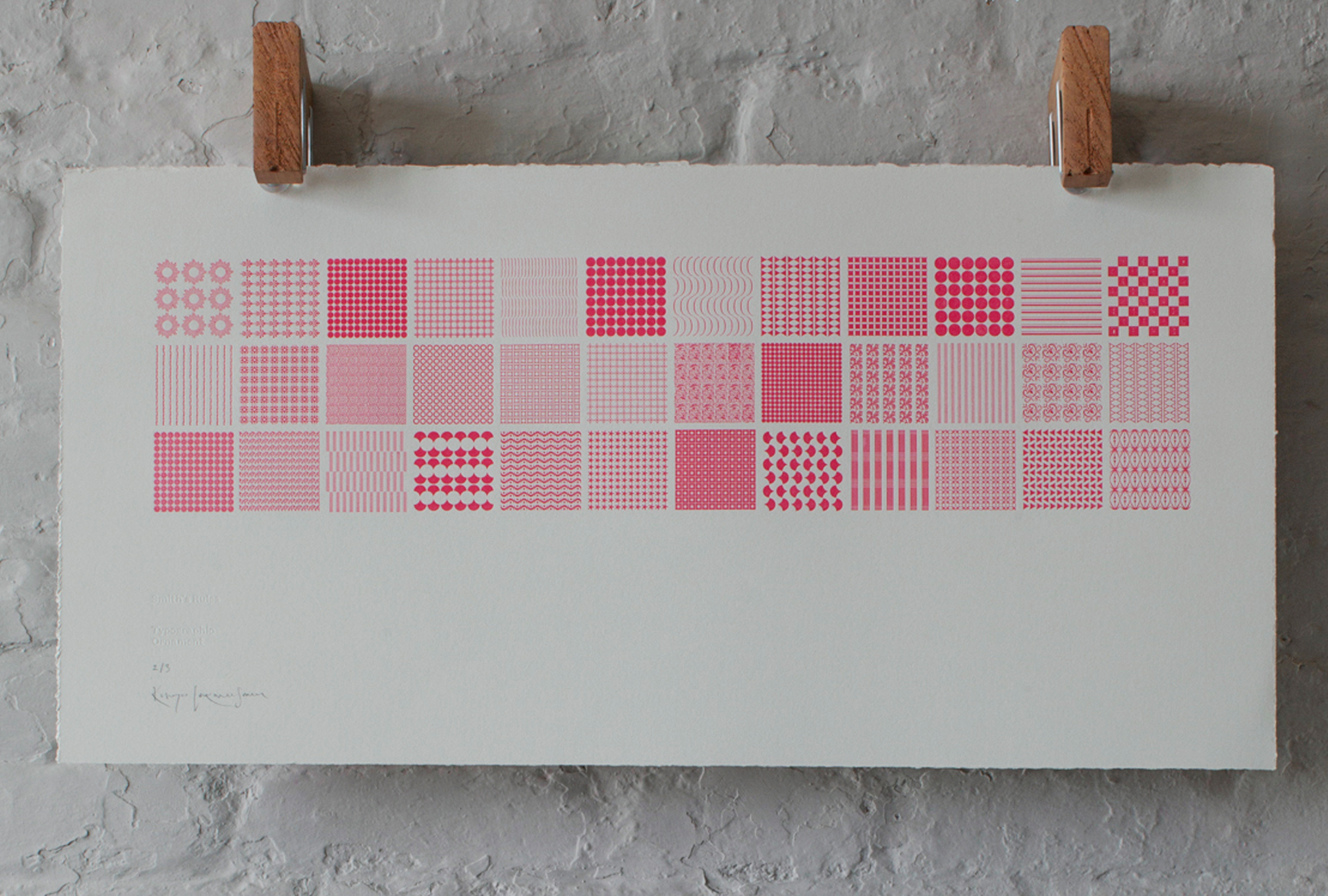
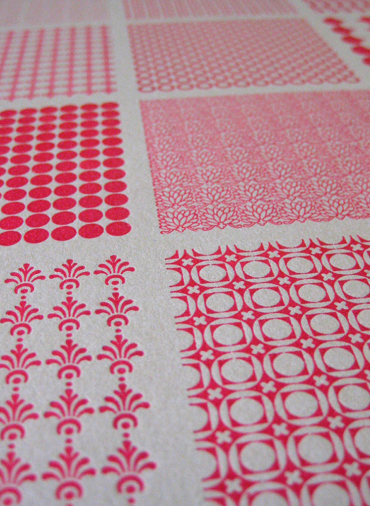
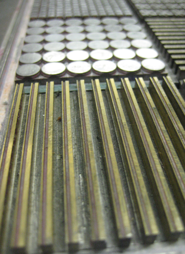
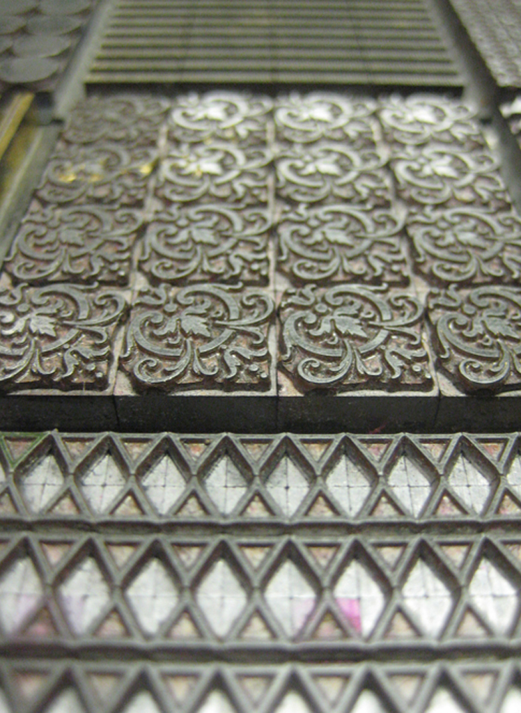
The ‘Typographic Ornament’ prints are constructed from a unique collection of metal type borders and ornaments. Mr Smith is in no way fancy – and as an antidote to the decorative nature of the material — the borders are formally hand-set on a simple grid system to reinforce the beauty of the original cuts and the grace of the formal arrangement. They are made in very limited editions and are printed on BFK Rives & Somerset cotton printmaking paper.
Typographic Ornament — A Landscape
Letterpress Print — Pink on Grey
Designed & hand-set
with Metal type Ornaments
& Printed in a Limited Edition of 6 /
in Fluorescent Pink ink
on 280gsm BFK Rives Grey
with a blind de-bossed credit /
760 x 380mm (30 x 15 inches)
Signed by the Artist
Buy from Section 4 of the Print Shop

![]()
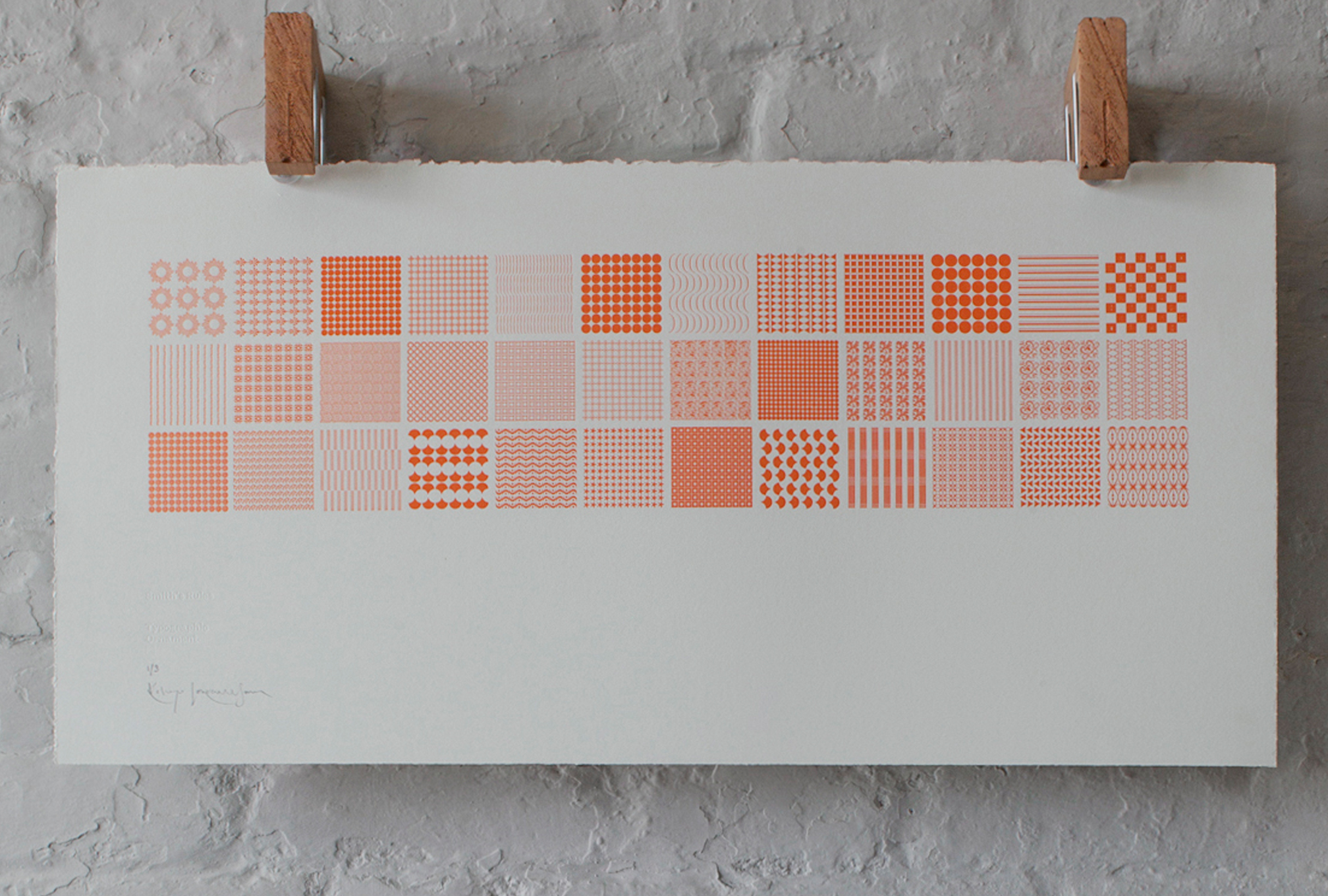
Typographic Ornament — A Landscape
Letterpress Print — Orange on Grey
Designed & hand-set
with Metal type Ornaments
& Printed in a Signed Limited Edition of 6 /
in Orange ink on 280gsm BFK Rives Grey /
with a blind de-bossed credit
760 x 380mm (30 x 15 inches)
Buy from Section 4 of the Print Shop
![]()
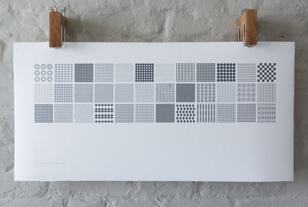
Typographic Ornament — A Landscape
Letterpress Print — Dark Grey on White
Designed & hand-set
with Metal type Ornaments
& Printed in a Signed Limited Edition of 6 /
in Gun metal Grey ink
on 1450gsm Zerkall Smooth /
with a blind de-bossed credit
760 x 380mm (30 x 15 inches)
Buy from Section 4 of the Print Shop
![]()
Typographic Ornament — A Landscape
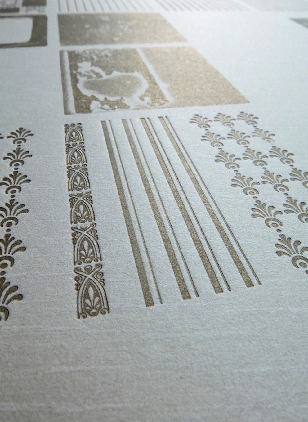
Letterpress Print — Gold on Tan
Designed & hand-set with Metal type Ornaments
& Printed in a Signed Limited Edition of 6 /
in Gold ink
on 280gsm BFK Rives Tan /
with a blind de-bossed credit
760 x 380mm (30 x 15 inches)
Each Print £280
Buy from Section 4 of the Print Shop
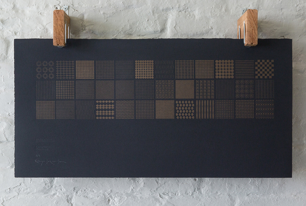
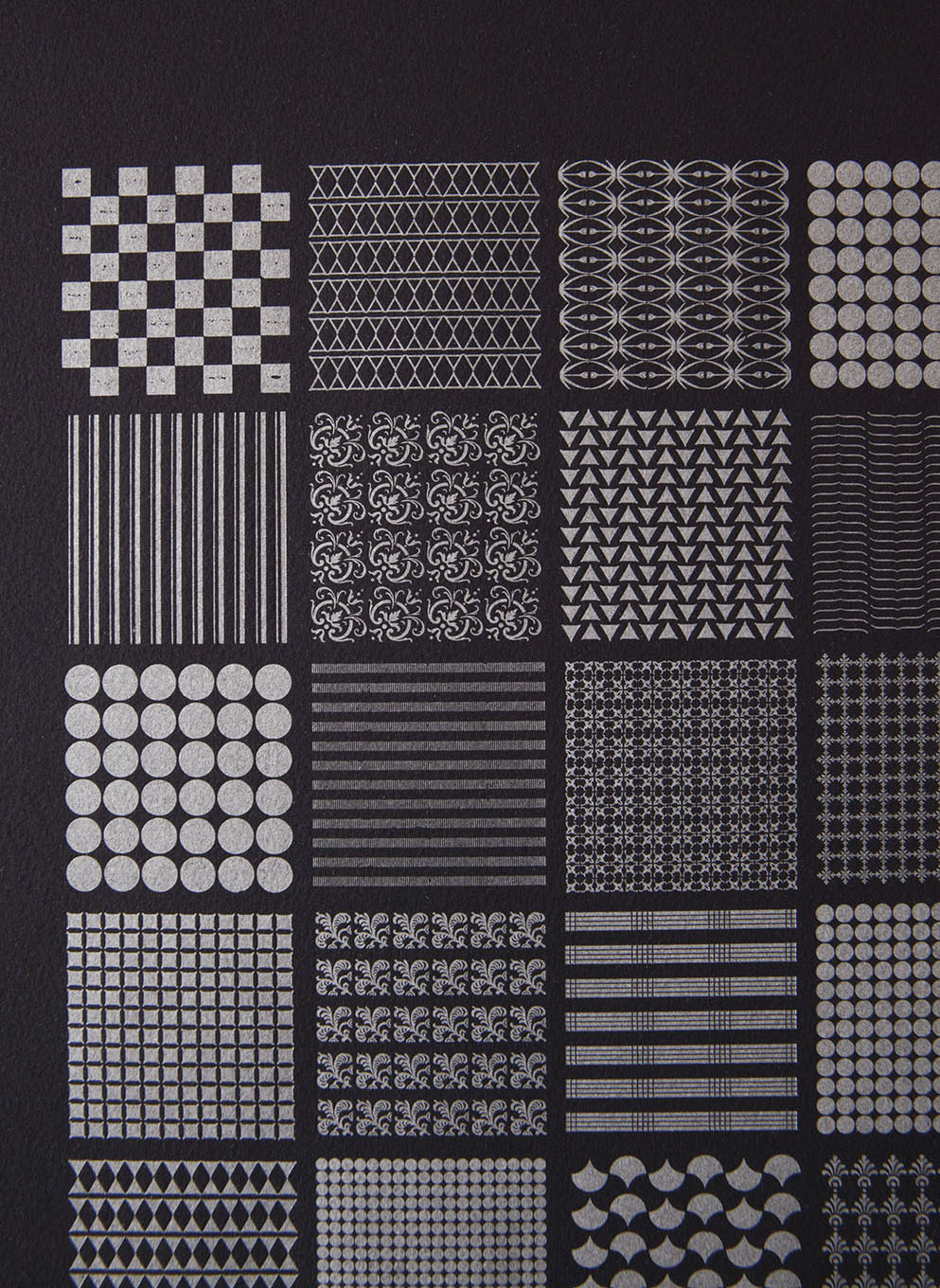
Typographic Ornament — A Landscape
Letterpress Print — Gold on Black
Designed & hand-set
with Metal type Ornaments
& Printed in a Signed Limited Edition of 6 /
in Gold ink
on 280gsm BFK Rives Grey /
with a blind de-bossed credit
760 x 380mm (30 x 15 inches)
Buy from Section 4 of the Print Shop
![]()